Dragica and Nenad wanted something different for their wedding, like a concert ticket and poster!


Dragica and Nenad wanted something different for their wedding, like a concert ticket and poster!
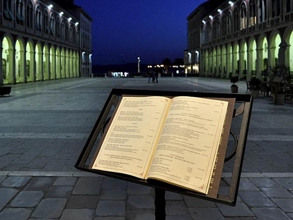
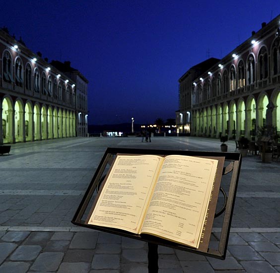
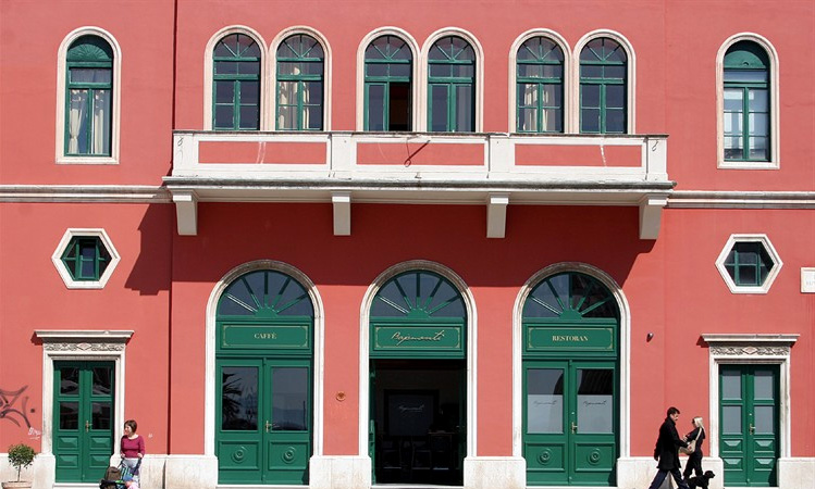
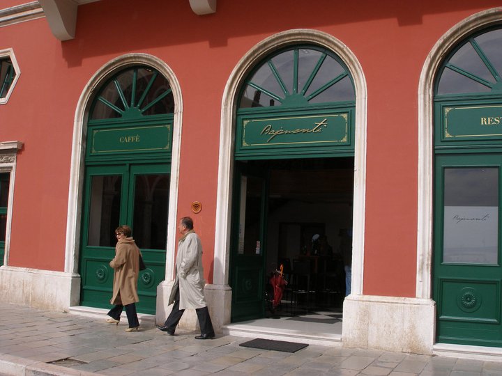
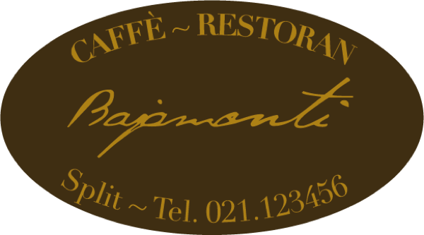
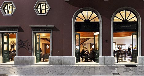
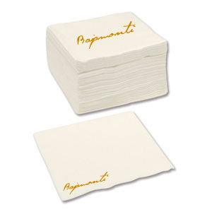
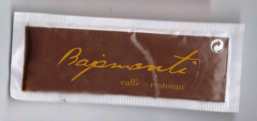
Located in the old city center of Split in place of the old cinema Marjan, the caffé got its name in memory of one of the most credited mayors in the history of the city, Antonio Bajamonti (1822 – 1891) who work very hard to create a modern European city during the Austro-Hungarian Empire period. With this background, we tried to give a kind of “old feeling” with the logo and printed material: the colors are dark and remind the old leather and rust. The font of the menus, Didot, was made between the end of the 18th and the beginning of the 19th century, when Mr. Bajamonti lived. The logotype is a modification of an handmade-like style font so that reminds a signature, as the old major is still there drinking his coffe. Work: visual identity, menus, visit cards and promotive materials.

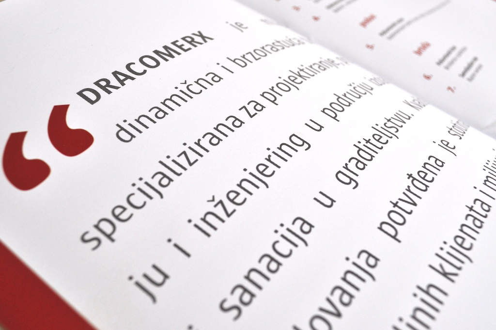
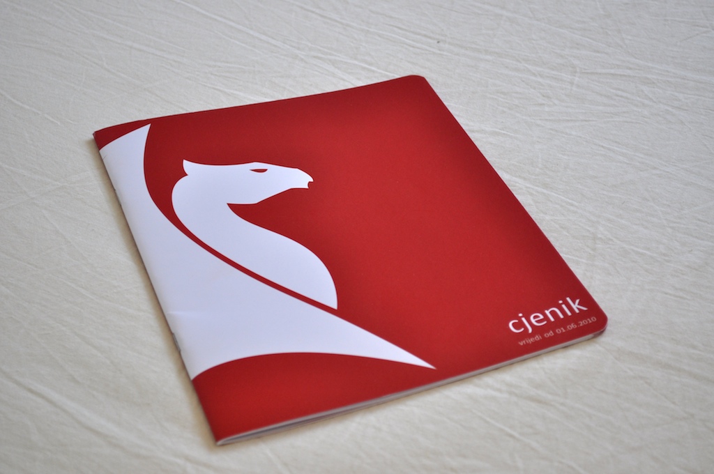
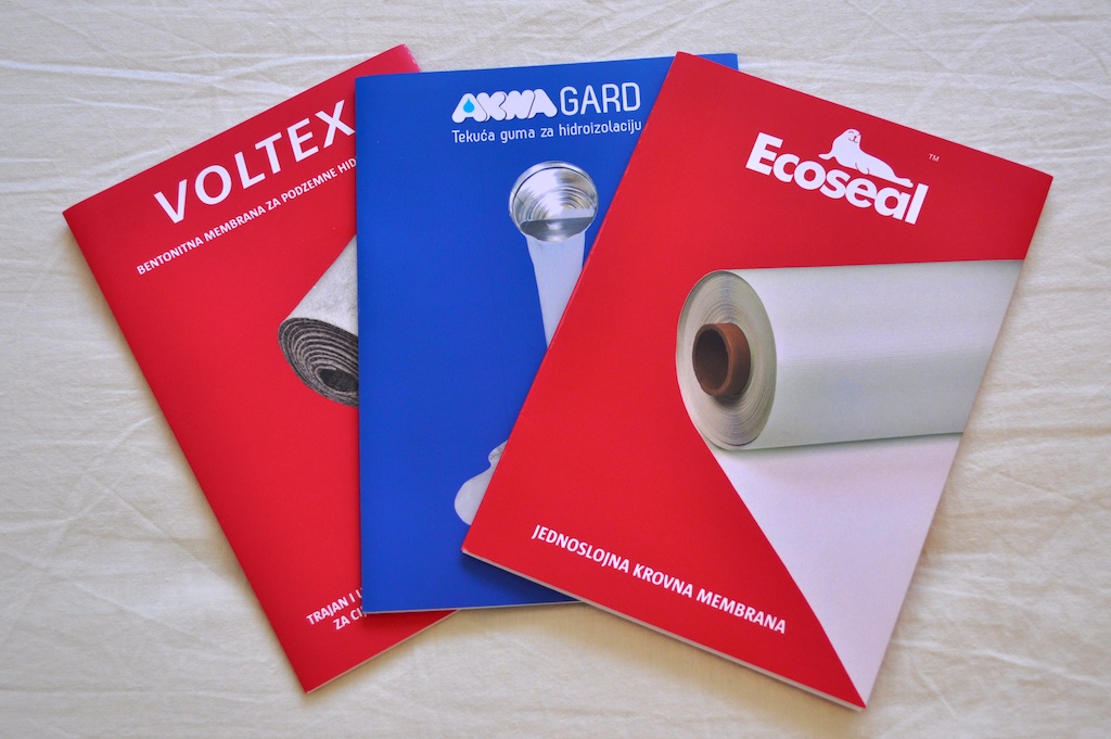
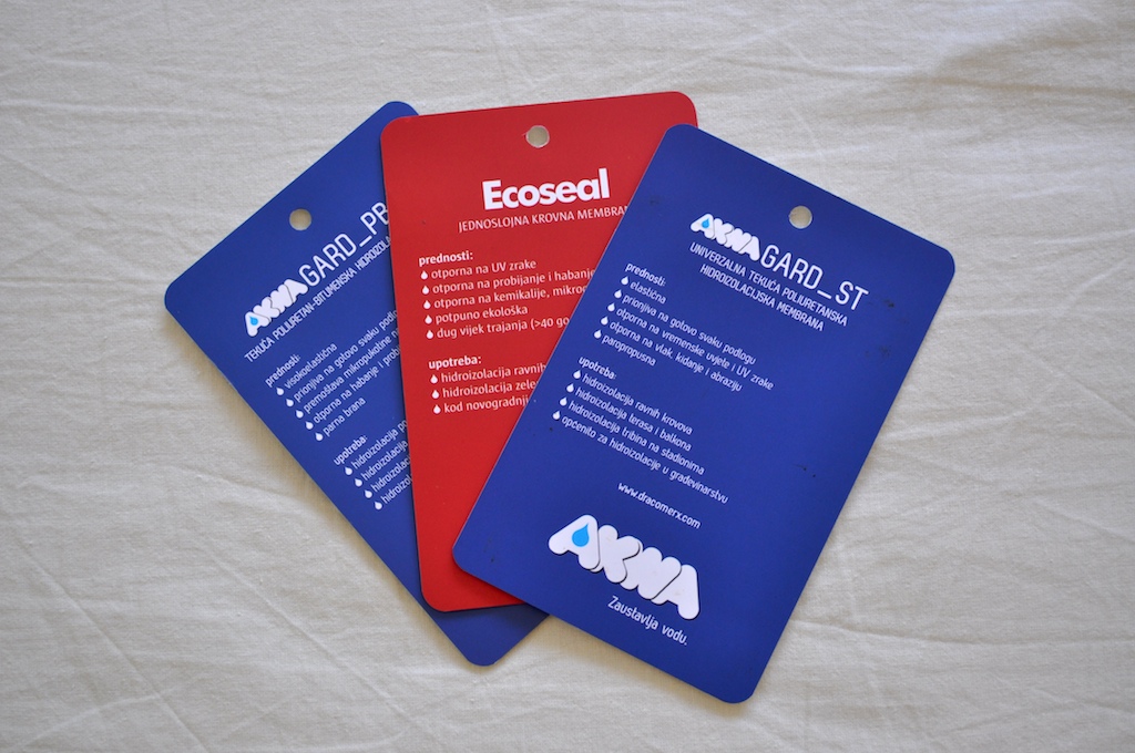
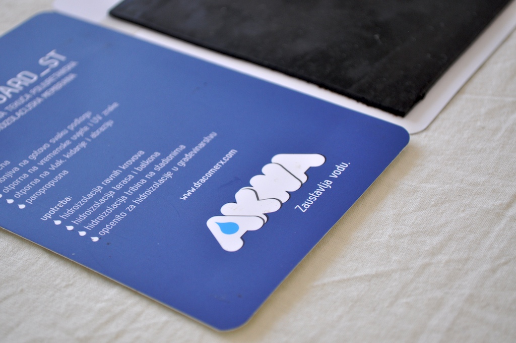
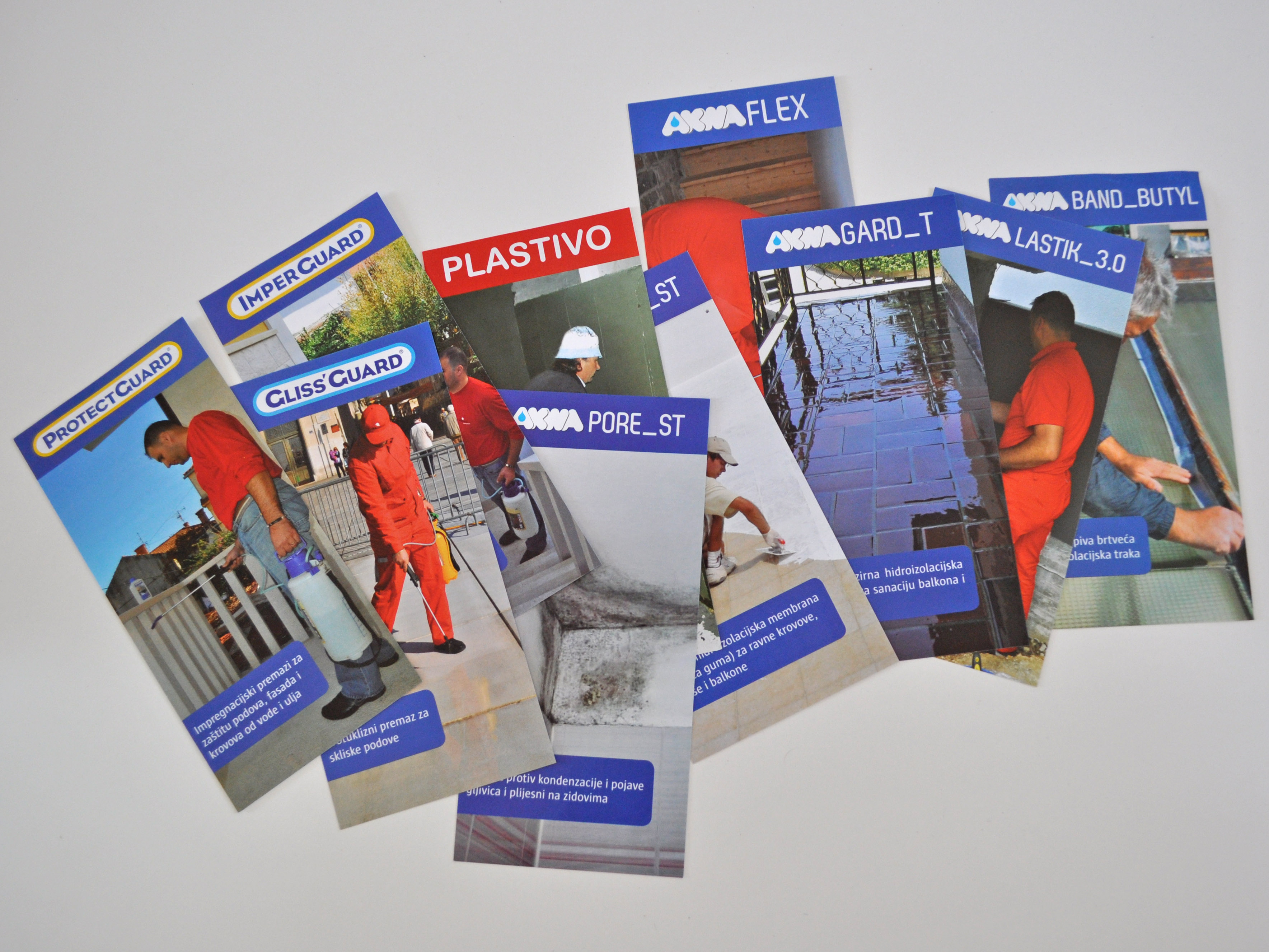
Dracomerx is a firm with an established visual identity for it and its products. What Dracomerx looked for was a graphic solution for its new products and incoming exhibitions, plus an architectural and graphic solution for its new chain of retail stores, the Draco Apoteka.
This included all the print materials (brochures, visit cards, posters, special tags, stickers, etc.), the vehicles, the buildings apparence and the ad campaign “Samo najbolje za zdravlje vaše kuće”.

Palir is a firm that works in the building insulation field and its owner called us in a big time for the firm: the 20th anniversary of the founding.
So we started with the logo and after some drafts we came with he actual one that keeps some concepts of the old logo (colours, the squareed shape) and introduce a new, modern font and the “page curl” effect that remembers the materials used for roof insulation. Then we adpted the new concept to all the print material and the vehicles.
We designed also a little logo for the 20th anniversary that will be printed on promotive material (like notes) and put on commercials.
Finally, the website was rebuild from scratch, with a modern look and a big gallery of works that Palir made in twenty years around the country.